Redecorating my bedroom
Back in March, I was visiting my sister and her newly-redecorated home, and it gave me the inspiration to finally redecorate my bedroom – something I’ve been thinking about for two years.
My bedroom used to have white walls, a dark grey feature wall, and a purple sliding wardrobe, all left by the previous owners. I added my own bed and a few other decorations when I first moved in, but nothing more substantial – enough to be functional, but not especially warm or inviting. I only ever took a handful of photos of this setup:
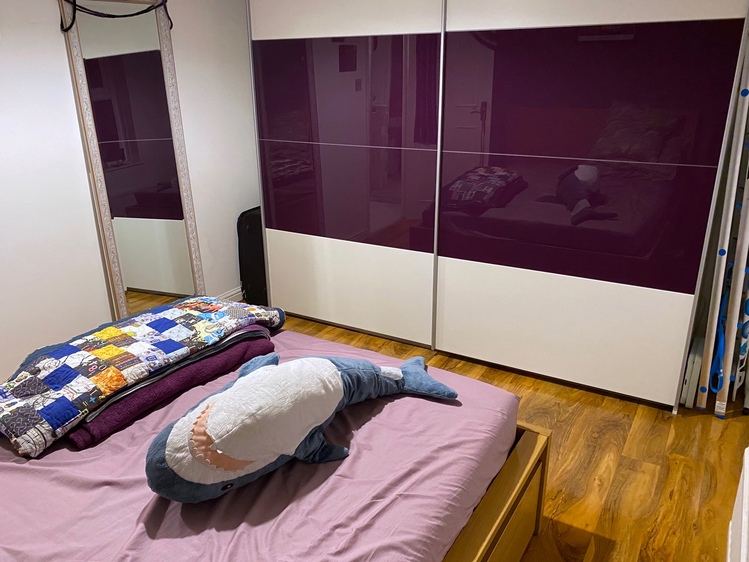
Ever since I moved in, I thought about adding a splash of colour to the walls and making it my own – probably purple, to match the large wardrobe – but I was never sure that it would work. I was always worried that more purple would make the room feel even colder than it already was.
One of my sister’s new rooms is pastel yellow, and it felt like a really nice space – and I decided I wanted that same yellow in my house. Purple and yellow is a combination that can work, with the right shades, but I could see this yellow wouldn’t go with the purple.
The purple wardrobe had to go.
I kept it when I moved in, because I couldn’t afford to replace it at the time, and it worked well enough – but it was never a great fit for my needs. It’s mostly hanging rails, with very little shelf storage, and two metres of clothes rail is way more than I need. The sliding doors also made it impossible to get to both halves at once; I had my pyjamas in one half and the laundry basket in the other. Getting changed for bed was always a mildly frustrated experience.
I’d been gradually saving towards its replacement, and now was the time. I broke out the toolbox and reduced the wardrobe to a pile of parts. I took great glee in disassembling something which has been a source of countless minor irritations.
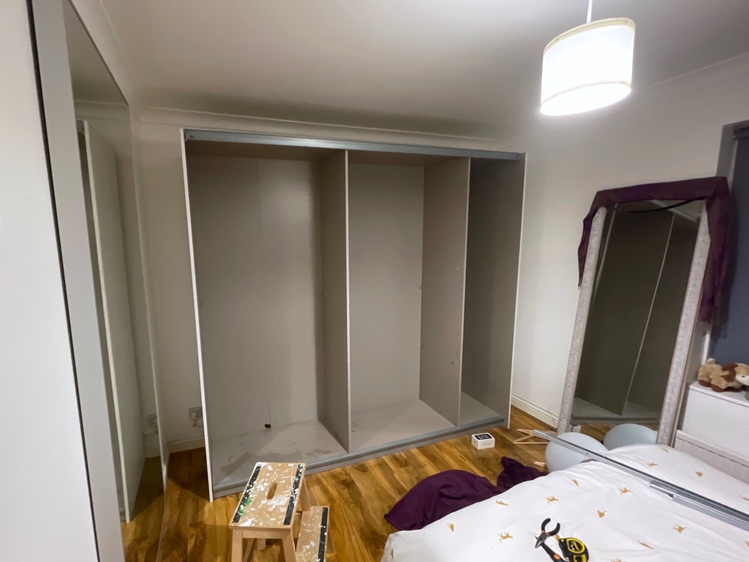
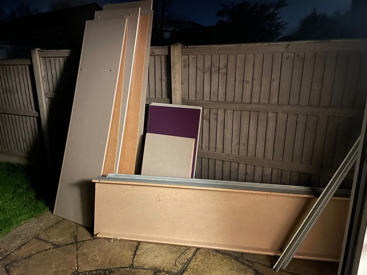
I was shocked by how much of a difference just this change made – as well as the purple doors, the interior of the wardrobe was a drab grey, and it sucked a lot of life out of the room. Just removing it made the room feel much lighter. (It also uncovered a previously unknown-to-me plug socket!)
The next day, I went to the paint shop, and I bought several shades of yellow. I went for pastel yellow on three of the walls (“Vanilla Sundae” 54YY 85/291), and a bright yellow to replace the grey on the feature wall (“Sun Flare” 22YY 57/627). I love having bright feature walls in my rooms; I think they really make a space “pop”.
I also redid the white on the ceiling, the skirting boards, and door frame, but do not ask me what shades they are. Dulux have more names for white than Eskimos have words for snow.
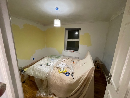
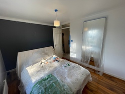
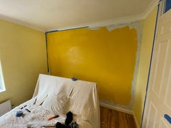
The painting took about a week, from start to finish. Each wall got at least two coats, plus a coat of primer over the dark grey to lighten it before I added the yellow. I’d always thought of the white walls in my bedroom as relatively clean, but I found lots of marks and scuffs on the wall that I’d previously missed – all gone now!
Once the painting was done, I wanted to review the furniture layout. In the old layout, there was quite a lot of “dead” space – behind the door and down the sides of the wardrobe, and I think that made the room feel smaller than it was. There was a lot of space I couldn’t use.
I decided to push the bed into the corner, and open up the room. This is a rough sketch of the new layout, which has way less “dead” space:
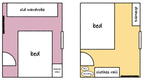
The key idea of this new layout is to combine all the free space into a single area into the centre of the room, rather than break it up with furniture in the middle. I did the same thing when I redecorated my office last year, and it made a big difference to the feel of the room.
I’ve lived with the new wall colours and furniture layout for about six weeks, and I’m really enjoying it. My bedroom has gone from drab and uninspiring, to warm and inviting.
This is how my bed looks now (and yes, those are cheetahs on the bedding):
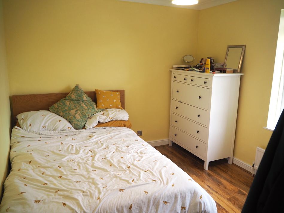
The chest of drawers gives me much more shelf space, and a lot of my clothes are now neatly packed inside. I also rearranged some of my under-bed storage, which I was only half-using. I’ve now repacked it so there’s a lot more stuff under there, mostly stuff I need to keep but don’t need to get to frequently – like my guest bedding and some old paperwork. In the new layout, I have easy access to one side and difficult access to the other, whereas before I had mediocre access to both sides.
At the other end of the room, the bright yellow adds a big burst of colour:
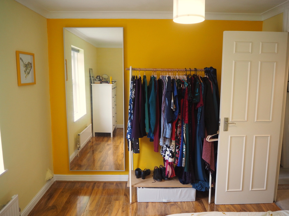
The mirror is massive, and makes the room feel bigger. It’s also delightful for twirling in front of and admiring my sparkly outfits. I always enjoy full-length when I stay in hotels, and I love having one in my bedroom – it’s well worth the difficulty it took to fix it to the wall.
The clothes rail is new, and adds a splash of extra colour. My clothes have a lot of bright colours, and I like having them on display, where I can enjoy them even when I’m not wearing them. Next to it, the door is hiding my messy laundry basket and waste bin. I can still get to them in a jiffy, but they’re invisible most of the time.
You’ll also notice my cheetah cross-stitch on the wall – the yellow frame is a perfect match for my feature wall, which was a happy coincidence. The picture was being framed while I was doing the painting, and I’d forgotten I had it on order.
I’ll keep tweaking, including some photos on the wall, but in the meantime this has been a nice improvement to the room where I spend every not-waking hour.