Launching a rocket in the worst possible way
Last month, NASA made headlines as they (finally) launched their SLS rocket as part of the Artemis 1 mission. The long and expensive development of SLS has been the subject of much debate, and caused a lot of online rage. I will now induce similar rage at a fraction of the cost.
NASA’s rocket reminded me of a little website I made last year, where you can control a rocket in the browser – all using web technology from the 1990s. You can fly in different directions, change speed, and even do a mid-space stop! In this post, we’ll peek under the covers and see how it works.

Accessibility note: this post has a lot of moving text and images. If you find that distracting, you can or play/pause the individual examples.
We can use the emoji rocket which comes with our browser, and which you may have seen elsewhere – this is a reusable rocket. Very environmentally conscientious!
🚀
Now let’s make it fly.
If you’re a hip, modern web developer, you probably know how to make things move on a web page. Maybe you’d use CSS animation, or Motion Path, or break out some @keyframes. But as we’re constantly told, things were better in the olden days, and that includes web technology. Old-school web nerds know the best way to move text in a web page: the unjustly-deprecated marquee tag.
<marquee>🚀</marquee>
If you’ve never come across it, the marquee tag causes text to scroll across a page. It makes our rocket move from right to left:
This looks pretty good already!
But you don’t need to be a rocket scientist to realise something’s wrong – we’re flying backwards! Almost all rocket emojis have the pointy bit in the upper-right, but the marquee tag is taking us to the left. We need to find a steering wheel.
You can steer a marquee tag with the direction attribute, which lets you pick one of four directions. The scroll will go in whatever direction you pick:
<marquee direction="up"> <marquee direction="right"> <marquee direction="down"> <marquee direction="left"> We can only pick a single direction; we can’t, for example, combine direction="up left" to get our rocket to move diagonally. This is probably for the best, as it avoids an inexperienced operator trying to launch their rocket in the direction "up down", which could go very wrong.
The marquee tag is also aware of non-English languages – it scrolls from right-to-left in my posts, but if you specify a right-to-left script with the dir attribute, it scrolls from left-to-right (opposite to the direction of the text).
<marquee dir="ltr"> <marquee dir="rtl"> This is good news for international relations: everyone can build rockets!
But it’s still a bit… slow. Space is big. Vastly, hugely, mind-bogglingly big. If a rocket is going to get across space, it has to be moving incredibly quickly. Can we go faster?
Text in the marquee tag doesn’t scroll as continuous motion; instead it gets updated at discrete intervals. The time between intervals is controlled by the scrolldelay attribute (which counts in milliseconds), and if we crank it up the discrete motion becomes more obvious:
<marquee scrolldelay="1000"> (1s) <marquee scrolldelay="5000"> (5s) The default value is 85 milliseconds, which is about 12 fps. I wonder if this is a limitation of graphics cards in the 1990s, and an attempt to reduce the number of times web pages had to be redrawn – the marquee tag was originally introduced in IE3, when computers were much less powerful. (Alternatively, maybe it’s some form of short-range teleport-based propulsion.)
If you want to crank down the interval below 60 milliseconds, you have to add the truespeed attribute. That feels like another sign that maybe this is designed to avoid over-taxing the computer, by clamping the refresh rate unless you explicitly opt in. Notice that scrolldelay="1" makes no difference until I add this attribute:
<marquee scrolldelay="60"> <marquee scrolldelay="1"> <marquee scrolldelay="1" truespeed> If you want to change how far the text scrolls at each interval, use the scrollamount attribute.
<marquee scrollamount="6"> (default) <marquee scrollamount="12"> <marquee scrollamount="24"> Although this doesn’t seem to have any limits, you may want to be careful.
If you really crank up the scrollamount, you can get some weird visual effects – the text might get stuck in place, or it might not be visible at all. In my browser (Safari), the rocket below just flips between two positions, offset 300 and 600 pixels from the right-hand side. If I shrink my window to less than 300 pixels wide, it disappears entirely. It reminds me of the wagon-wheel effect.
<marquee scrollamount="300"> So now we can launch our rocket, set a direction and pick a speed – and then we’ll keep going that way, that speed, forever.
What if we need to change course? Maybe our advanced autopilot has spotted a parked spaceship, there’s an asteroid up ahead, or an astronaut ran out into the road. Can we get some controls?
If I’ve learnt anything from watching Star Trek, it’s that all the best interfaces have buttons, preferably physical ones. We should design a panel of buttons that control our rocket. And of course, lots of people need buttons on the web, so there’s an HTML tag you can use for making buttons. Can you guess what it is?
That’s right, it’s the marquee tag.
We can set scrollamount="0", which makes it static, so it moves like a button. We can add a style to can change its appearance, so it looks like a button. And we can define an onclick handler to make it do something when the user clicks, so it behaves like a button.
Here’s an example:
<marquee
  id="up"
  scrollamount="0"
  style="background: white; width: 35px; height: 44px; cursor: hand;"
  onclick="document.getElementById('rocket').direction = 'up';"
>
  ↑
</marquee>
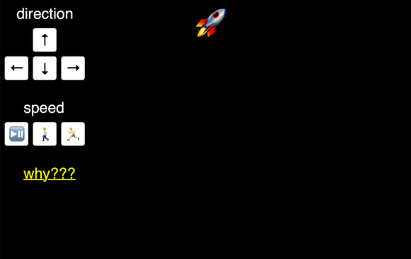
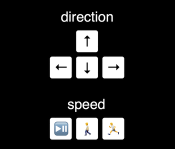
Once I had this brilliant idea, I was able to construct a panel of buttons to control the rocket:


The onclick handlers for direction and speed are finding the scrolling element, then modifying the various direction/speed attributes we’ve discussed above.
I’m arranging the buttons into a grid with position: absolute; and fixed margins, which mean they’ll always be in the same place. Muscle memory for buttons is very useful!
The play/pause button uses two handy methods on the marquee tag: stop() and start(), which will stop and start the scrolling. I’m slightly perturbed that there’s no way to determine if a marquee is currently scrolling; I have to store that state in an external variable – but it seems to work.
These controls are where you really see the differences in browser support. The direction and speed controls behave differently across browsers. In some browsers, they take immediate effect, in others you have to wait for the current scroll to complete before you see any change.
The marquee tag has been deprecated for years, and even when it was supported there were probably only a handful of sites that were dynamically changing the direction or speed. It’s unsurprising, if disappointing, that a consensus has failed to emerge.
These buttons control a single rocket, but advanced rockets have multiple stages. While I was writing this blog post, I discovered that we can also do multistage rockets with the marquee tag – by nesting tags inside each other.
<marquee>
  🚀 first
  <marquee>
    🚀 second
    <marquee>🚀 third stage 🚀</marquee>
    stage 🚀
  </marquee>
  stage 🚀
</marquee>
This looks about as good as you’d expect:
Different browsers render this even more differently, so you may see something completely different to me.
I learnt this when I screwed up the escaping in a draft of this post, and got an HTML file with half a dozen unclosed <marquee> tags. I was struck by the complete visual mess that stood before me. The possibilities are as endless as they are horrifying.
Why are you doing this?
This all started when Laurie Voss ran an <Angle> Bracket tournament, a series of Twitter polls to determine the Internet’s favourite HTML tag. I was following Danielle Leong, who was a fearless cheerleader of the marquee tag, and I discovered the tournament through her tweets.
The four finalists were <a>, <div>, <marquee> and <script>, and Laurie tweeted what could only be read as a challenge:
An unexpected side effect of this tournament has been watching people come up with ways to write complete web apps using fewer and fewer tags.
How far could I get with just <marquee>?
I built the <marquee> rocket as a small website with a bit of interactivity that only uses the marquee tag – and to prove that you don’t need <script> to do JavaScript shenanigans.
It was a useful reminder that HTML is enormous, and I only know a tiny fraction of it. I’d been aware of the marquee tag for over a decade, but I thought it was just for horizontally scrolling text. I didn’t know about any of these attributes or methods – so how much stuff am I missing on the bits of HTML I actually use on a day-to-day basis?
And although I’m never going to use my newfound knowledge of the marquee tag, I did learn some things which might actually be useful in a real project – including the right-to-left script modifier, and some stuff around the “reduce motion” accessibility settings which I’m using in this post.
I’ll end with a final example, which brings together all our new marquee knowledge:
<marquee direction="right" scrollamount="1" scrolldelay="30" truespeed>🌍
NASA aren’t the only ones who can send a rocket to the Moon.