Inclusion can’t be an afterthought
Earlier today, I gave a talk for the Open Life Science Program about designing with inclusion in mind. I was emphasising that inclusion has to be part of the design process, not an afterthought, and I talked a bit about unconscious bias and the effect it has on inclusion.
The cohort calls are recorded, and you can watch a video on YouTube. You can also download my slides as a PDF or read my notes below.
References and links
References for stuff I mentioned:
- You don’t know what you don’t know: How our unconscious minds undermine the workplace, by Laszlo Bock and Brian Welle
- When it comes to photos, Google Photos remains blind, by Tom Simonite
- A clue to the reason for women’s pervasive car-safety problem, by Sarah Holder
- Where are all the female crash test dummies?, by Anna Holland Smith
Slides and notes
Title slide.
I’m going to talk about the importance of inclusion in design, and tell you some stories that show what happens when we don’t think about it. I’ll also talk a bit about unconscious bias, and how that seeps into the design we do.
Although I’m a software developer, these ideas are broadly applicable and matter to science just as much as technology.
Image by bridgesward from Pixabay. Used under CC0.
First, let me define what I mean by “inclusion”. It’s a term we hear a lot, alongside terms like “diversity” and “accessibility”, and it’s worth explaining exactly what I think it means.
Imagine you were holding a party. (Please, just imagine – can you tell I wrote this slide before COVID-19?)
If you send invitations far and wide, that’s diversity. You’re encouraging lots of different people to join you, but not giving a reason why they might want to come to your party.
If you make sure everyone has a good time at the party, that’s inclusion. That might mean providing non-alcoholic drinks, food that everybody can eat, or spending extra time with the person who drove two hours to see you. It’s making the effort to ensure everyone feels included and welcome.
In inclusive communities, more people feel comfortable and safe to share their experience; talk about their ideas; challenge the status quo – all of which have benefits for science. We want as many ideas as possible, and allowing a wide range of people to contribute helps us to get better science.
But this doesn’t always happen in practice – in many groups, people can feel excluded, unsafe, forgotten. Assuming it’s not malice, why does this happen?
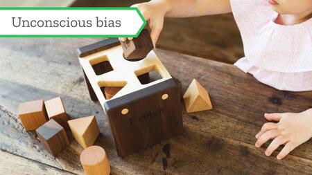
Image: personalised shape sorter by SmilingTreeToys on Etsy.
Let’s talk a bit about unconscious bias. I don’t love the term – at times it can feel negative, critical, “You have biases and that makes you a bad person” – which is a shame, because I think there’s a useful idea here. Let’s look at it another way.
Humans are very good at pattern matching. We look at the world, we spot patterns, we create rules about how we think the world works. Everything is A or B. If P, then Q. All Xs are Ys. And so on. The rules we imagine aren’t always correct; the more of the world we see, the more we have to update our rules based on new ideas and information. This is a natural part of being human.
(Science is an extension of this behaviour: we’re trying to spot rules and patterns in the world we see around us.)
Often we come up with these rules subconsciously; we’re so good at coming up with these patterns, we don’t realise how many of them we’ve internalised. We don’t noticed we’ve adopted a rule until we see something breaks it. This is what unconscious bias is: we imagine the world follows a particular rule, but that rule excludes or overlooks some groups of people. When we act upon that rule, we can do something that makes them feel unwelcome.
Having unconscious biases isn’t a moral judgement on us; it’s our pattern-matching behaviour gone slightly awry.
Let’s look at some examples.
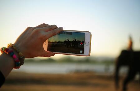
Image by Teono123 No on Pexels. Used under CC0.
We all have smartphones, and many of us use them to record video. And if you’re recording video, you might be uploading it to YouTube.
When YouTube released their first upload app for the iPhone, they discovered that about 5 to 10 percent of their users were uploading videos upside-down. Was it a mistake? A fashion trend? Some sort of statement piece?
No; it was a misunderstanding about how people use their phones. Look at the picture. The person is holding the phone in their left hand, so their right-hand is free to tap the on-screen controls. This person is probably right-handed. Now imagine how a left-handed person would record video: they’d hold the phone in their right hand, and leave their dominant left hand free to tap the controls.
YouTube’s mostly right-handed development team hadn’t thought of this use case. They’d internalised a bad rule: if somebody is recording video, they hold their phone in this orientation. It wasn’t until they had left-handed users that they realised the mistake.
Let’s look at another example.
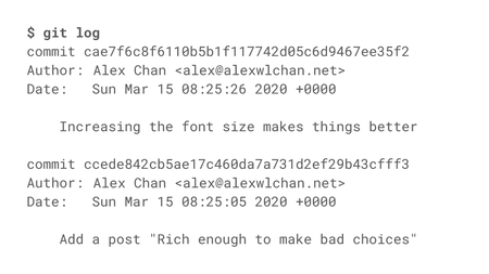
I know the Open Life Science course includes some sessions on Git and GitHub, both widely-used pieces of software. One of the great features of Git is that it keeps an immutable record of your changes. It’s impossible to change history without it being disruptive or obvious.
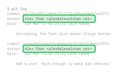
That immutable history includes your code, your commit message, the timestamp – and your name. The committer’s name is permanently baked into the code history.
This can cause problems for people who change their names, because their old name will remain in the Git history. I have trans friends who’ve changed their name and had to choose between abandoning a large body of work, or accepting that the Git history will forever out them as trans.
I don’t think this was malice from the Git developers; they’d just internalised a bad rule: nobody ever changes their name. It didn’t occur to them that this design choice might exclude some users, and now we’re all stuck with it.
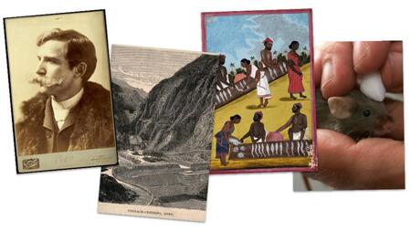
Images all used under CC BY, L–R:
(1) Henry Wellcome, photograph by Henry van der Weyde.
(2) Comparative heights of mountains, engraving by S. Hall, 1817.
(3) A fish market in India, gouache drawing 18–.
(4) A shrew mole, coloured engraving.
Let’s look at an example from my workplace. I work at Wellcome Collection, a museum and library about the history of human health and medicine, and one of the things we have is a large collection of digital images.
We’d love to use machine learning and computer vision tools to tag our images, to make them easier for people to find. Maybe an algorithm could tell us that these images are a man, mountains, a market, or a mole. But we have to be careful – machine learning is very good at replicating biases in the training set.
There are plenty of stories about algorithms replicating the unconscious biases of the humans who trained them. A few years back, Google got in hot water for tagging images of black users as “gorillas”, and Microsoft have had similar issues with motion tracking in their games consoles. A more racially diverse team might have caught that before it shipped to customers.

Image by Pixel-mixer on Pixabay. Used under CC0.
Finally, let’s move out of the digital realm and look at a physical example.
Modern cars are extremely safe. They’re subject to rigorous crash testing and are packed with safety features – but repeated studies show that women are more likely to die in car accidents.
That’s because until fairly recently, crash tests only featured male-bodied test dummies. They were based on a fiftieth percentile American man, and that was the basis for safety features. Women – especially smaller women – are quite different from this body shape and size, and they experience the forces in a collision in a more severe way. The car industry does now use a wider variety of crash test dummies, but it’ll be a long time before this inequality is worked out of our cars.
So what’s the message here?
Inclusion has to be part of our design process. It’s not something we can add later, not something we sprinkle on at the end; it has to be something we think about throughout our work. Throughout our design process.
It’s much harder (and more embarrassing) to fix something after-the-fact, rather than getting it right from the early stages. We need to think about inclusion throughout. Inclusion has to be part of our design process.
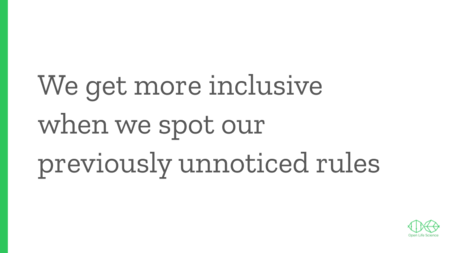
Hopefully I’ve convinced you that you need to think about inclusion all the time, so how do we do that?
Let’s go back to the idea of rules. We exclude people because we internalise rules that don’t accommodate people, that don’t include them. How do we spot those bad rules? Often we don’t even realise they’re there, so how can we possibly correct them?
We need to widen our worldview; go out and listen to people who have different experiences to us. We won’t know a rule is bad until we see a counterexample, so we want to make it easy to get counterexamples. I find Twitter useful for this: I try to follow people who are different to me, I read about their lives and their challenges, and that affects my view of the world. Twitter certainly isn’t the only way to do this – find any medium that lets you hear from people who don’t look like you – but it’s the one that works for me.
Closing slide.
I hope I’ve convinced you that inclusion needs to be part of the design process. It’s something we have to think about throughout, not just tack on at the end.
To be more inclusive, take my framing of unconscious bias, think about those patterns we don’t realise we’re spotting, and try to find ways to notice the unhelpful patterns that you’ve internalised.