Thoughts on Overcast
On Wednesday, Marco Arment released his long-awaited podcast app, Overcast. I’ve only been using it for a few days, but it’s already displaced Pocket Casts as my podcast app of choice.
I was surprised by how much I liked Smart Speed. Like Marco (and many other people), I don’t enjoy listening to podcasts played at faster speeds, because the quality takes a nosedive. Smart Speed not only makes podcasts go faster, it makes them sound better for doing so. Conversations are tighter and more coherent, and I already miss the feature when I go back to another app.
Smart Speed alone would keep me using Overcast, but the little details are just as important. Overcast is packed with nice touches and polish. These are a few of my favourites.
Listing alternative podcast apps
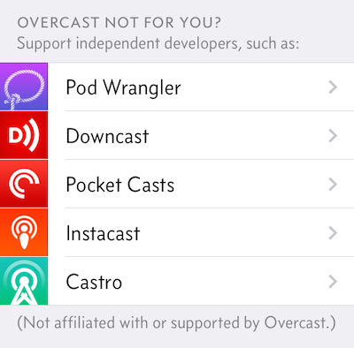
In the Settings screen, there’s a list of Overcast’s competitors (randomly ordered to avoid any bias). Tapping one opens an App Store page for that app.

This is a super classy move on Marco’s part.
Onboarding screen and subtitles
Overcast has the best onboarding screen for any app that I’ve ever seen. When you first launch the app, you’re prompted to create an account, with a prominent link to a Skeptic’s FAQ that explains why a podcast app needs an account. The FAQ is very friendly and well-written, unlike the legalese you often encounter in similar pages.
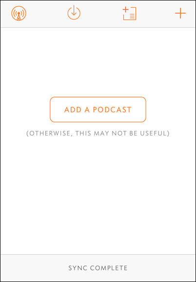
The next screen, which encourages you to add your first podcast, is really nice as well:

There are several other subtitles like this throughout the app: friendly and well-written, they remain helpful without being patronising or annoying.
Normalising RSS feeds
In a list of podcasts, Overcast makes the “author”1 of a podcast fairly prominent.
But not all podcasts list their author list in the same way. There are two prevailing styles:
- With an “and” between the final two items: e.g., “Guy English and Rene Ritchie” (Debug)
- Without the “and”: e.g. “Marco Arment, Casey Liss, John Siracusa” (ATP)
In Overcast, the “and” is removed and authors are always shown in the second style, regardless of how the feed is formatted. Everything looks neat and consistent. It doesn’t affect the functionality of the app, but it’s another nice touch.
this one leapt out at me because the author information is so prominent, and I happen to maintain a feed which does include the “and”.
Update, 25 July 2014: Marco chimed in on Twitter to highlight one other aspect of his server-side normalisation of feeds:
@alexwlchan I’m also stripping common prefixes from episode titles within a feed, so:
Episode 1: A
Episode 2: B
->
1: A
2: BAt the beginning of the latest episode of ATP, Marco talked a little more about the server-side parsing, the motivation behind using a server rather than processing RSS feeds client side, and dealing with malformed or incorrect XML.
Granular skip buttons in Control Centre
In the Settings screen, you can set choose how many seconds you want to skip back or forward when listening to a podcast.
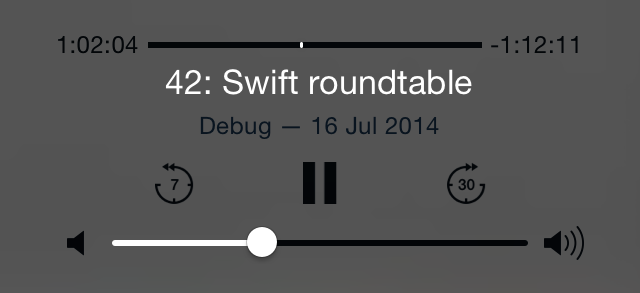
What’s particularly nice is when you change this from the default, then look carefully at the buttons in Control Centre (or the lock screen controls):

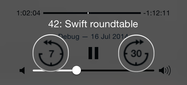
The text is quite small, but you can see that the buttons are labelled with the number of seconds that will be skipped. (Toggle the screenshot to see blown up versions of buttons.) Those labels get updated to reflect your skip settings.
I was a bit confused that the same buttons weren’t being used on the Now Playing screen in Overcast itself, but apparently that’s coming in a future update.
Sharing links to a specific timestamp
Although this isn’t supported in the iOS app yet2, the website lets you share a link to a specific point within a podcast. For example, I can link to the point in the latest ATP when they started discussing Overcast, half an hour in.
I’d be surprised if this wasn’t in part inspired by Hypercritical and ATP. In the final episode of Hypercritical, John lamented that the amount of followup at the beginning of each episode made it hard to share shows. Telling somebody to skip the followup at the start of the show makes it much more likely that they just won’t bother. ATP has the same problem – a glut of followup at the start of each show.
This is an easy way to link to an episode and skip all the followup. I think I’m going to be using this feature a lot.
Conclusion
Overcast definitely has a couple of rough edges, but overall it’s a solid 1.0. It’s already become my new podcast app of choice.
If you’ve never listened to a podcast before, then I think it would make a good starting point. If you already have a dozen subscriptions, then you might really appreciate the audio processing features.
It’s free to try on the App Store (with a $5 in-app purchase to unlock the full feature set), so I think you should definitely give it a go.
